Foundations
Interaction Design
UI Design
Learning Series
Navigation Is More Than a Menu
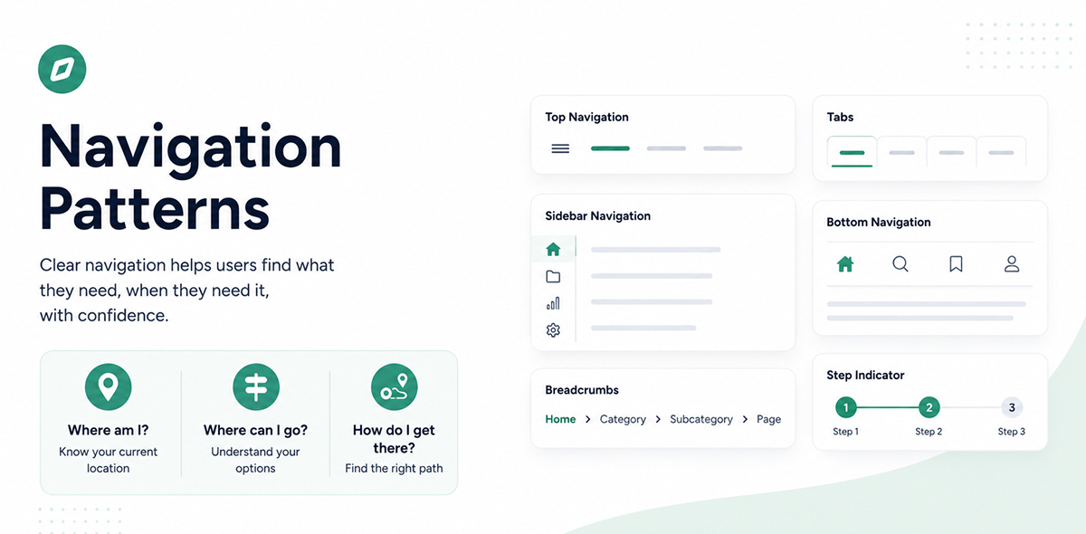
This story introduces navigation as more than just a menu or UI component. Using an airport as a familiar example, it explains how good navigation helps users understand where they are, where they can go, and how to get there. It explores navigation as a connected system shaped by users, content, tasks, and context, setting the foundation for understanding different navigation patterns across desktop and mobile products.
Navigation Is More Than a Menu
When we hear the word navigation, we often think of a menu. A hamburger icon on mobile, a navigation bar at the top of a website, or a sidebar in a dashboard. But navigation is much bigger than the menu itself.
Navigation is how people understand where they are, where they can go, and how they can get there.
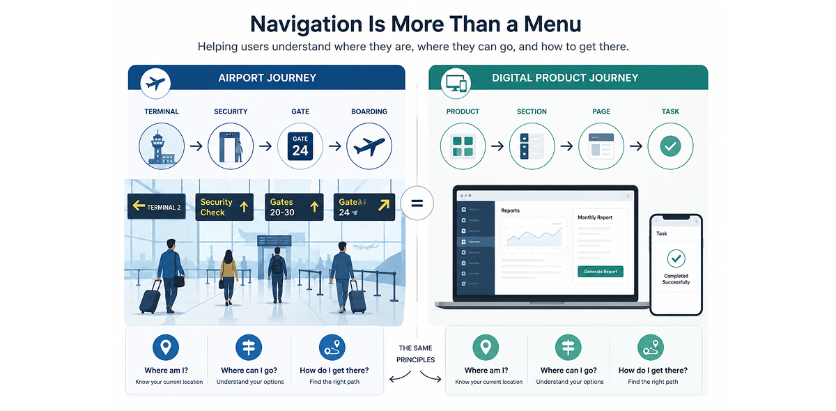
To understand this, think about an airport you have never been to before. You have a flight to catch, but you do not know the layout. You need to find the check-in counter, then security, then your gate. Along the way, you may need to find a restroom, a lounge, or a café.
The airport does not simply give you one big directory and expect you to figure everything out. Navigation is built into the entire experience.
Some signs tell you where you are. Large boards show flight information. Directional signs point you towards security, gates, baggage claim, and exits. Gate numbers help you understand your destination. Colours, symbols, maps, and repeated signposts give you confidence that you are moving in the right direction.
At every step, the airport helps you answer three simple questions: Where am I? Where can I go? How do I get there?
Digital products need to do the same.
In a digital product, the menu is just one part of the navigation system. A breadcrumb can tell you where you are. A back button can help you retrace your steps. A tab can show you the sections available within a page. A link can take you to related content. These elements may look different, but they all play a role in helping users understand and move through the product.
Just like airport signs help travellers understand the physical space around them, digital navigation helps users understand the information space they are moving through. Similarly in Digital products, navigation is not just a UI component. It is a core part of the user experience, setting the mental model to align with the product space they are in.
Think about the airport again. If you are at Terminal 2, you should immediately know it. If you need to reach Gate 24, you should be able to understand where to go. You should not have to keep checking the main airport map every few minutes to figure out where you are or what to do next. If the gate is far away, clear signs should guide you along the journey. You see "Security", follow the arrow, then see "Gates 20 to 30", and keep moving. Each sign gives you just enough information to take the next step. The signs are doing their job without demanding your attention.
A well-designed digital product works in much the same way. Users should know where they are, understand where they can go, and have a clear idea of how to get there. They should know where to look, understand what a label means, and be able to predict what will happen when they click or tap. Users should be shown only enough information needed at that time.
When navigation is clear, users can focus on what they actually came to do instead of spending time figuring out where to go.
This is also why choosing a navigation pattern should not be the first decision a designer makes.
It is easy to start with questions like, "Should I use a hamburger menu or a tab bar?" But before choosing a pattern, we need to understand the product and the people using it. What are users trying to accomplish? What information do they need? How often do they move between sections? Which destinations matter most? How much content needs to be organised? What do users already understand about the product? These questions are shaped by information architecture, user research, and product strategy. The navigation UI comes later.
Think about the airport again. The airport does not put up a sign saying "Gate 24" simply because the sign looks good. The sign exists because passengers need to reach Gate 24. Its location, wording, size, visibility, and direction are all designed to support that journey. The same principle applies to digital products. We first need to understand the users, their tasks, and the content. Then we can choose a navigation system that supports their journey.
And navigation is rarely just one thing. It is a connected system. In an airport, the main signs help you understand the overall layout. Terminal signs help you find the right building. Gate signs help you reach your destination. Flight information boards provide context and updates. Directional signs guide you through the journey. Even a small sign pointing towards a restroom or baggage claim plays a role.
Digital products work in the same way. A product may have primary navigation for major sections, secondary navigation for subsections, contextual links for related content, breadcrumbs for orientation, and actions that help users move forward or backwards. Each element has a role, and each should appear at the right moment. When navigation works as a system, users do not have to constantly rebuild a mental map of the product in their heads. They can simply move forward with confidence.
There is also no universally "best" navigation pattern. A banking app has different needs from an e-commerce website. A content-heavy news platform has different needs from a project management tool. A mobile app has different constraints from a desktop dashboard. Even within the same product, different screens may need different approaches.
A dashboard may need persistent navigation to help users move between major areas. A content-heavy website may need breadcrumbs to show where users are within a deep information structure. A mobile app may need a compact navigation pattern because screen space is limited.
Once we start seeing navigation as a system rather than a menu, the design decisions become clearer.
We need to start by asking better questions. Which destination matters most to the user? How should the sections be grouped? What should always be visible? What can be revealed when needed? How will users know where they are? What is the next step in their journey? The answers to these questions lead us to the different navigation patterns we use across desktop and mobile products.
The right choice depends on the relationship between users, content, tasks, and context. Good navigation reduces cognitive load, removes friction, and helps users complete tasks faster. It reduces wrong turns, unnecessary backtracking, and the frustration of opening pages that do not lead where they expected. Navigation is such an important part of usability and the overall user experience. A clear navigation system creates confidence. Users feel in control as they move through the product, just as travellers feel confident when they can easily find their way through an airport.
In the upcoming stories, we will explore the different navigation patterns used across desktop and mobile products. We will look at what each pattern is, how it works, when to use it, where it can fall short, and how to choose the right approach based on the users, content, tasks, and context.
Have a story to share?
Join our community of designers sharing their experiences and insights.
Share Your Story