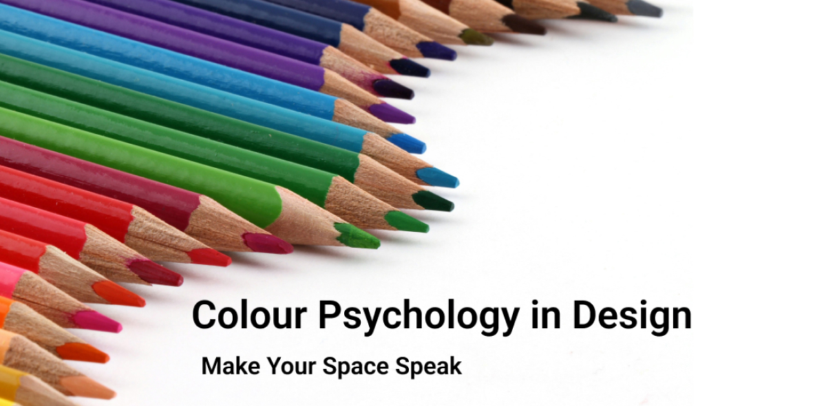
Colour Psychology in Design
Different colours evoke specific feelings, like blue for trust, red for energy, or green for growth. This can shape how people interact with products, brands, and environments.
Colour Psychology is the study of how colours influence human emotions, perceptions, and behaviours. Different colours evoke specific feelings, like blue for trust, red for energy, or green for growth. This can shape how people interact with products, brands, and environments. It’s widely used in marketing, design, and branding to guide decisions and create desired emotional responses. Translating colour psychology into digital product design is all about aligning colours with user emotions, behaviour, and brand perception while ensuring usability and accessibility.
Choosing colour for your Brand
The first step in creating an effective colour palette is to understand your Brand and Product goals. Question yourself on who the target users are, what the product is related to, what emotions it triggers, where they use the product, and so on. For example, a finance app should communicate trust and stability, which is why blue or green works well. On the other hand, a fitness app should encourage energy and motivation, making vibrant shades of red or orange a stronger choice. A sustainable clothing brand in natural, earthy shades. Your palette should always tie back to the emotions and values your brand stands for.
Map your colours to UI Elements
Think about where and how each colour is used in your product. Purpose, hierarchy, visual affordance.
Example:
Primary Call-to-action buttons: Bright, attention-grabbing (Primary or brand colours)
Secondary actions: Accents, complementary actions
Backgrounds: Neutral, calming (white, light grey, soft blue)
Notifications, Alerts, Status: Blue for Information, Red for danger or error, Yellow for warning, Green for success
Text & Typography: High contrast for readability; black/grey for primary text
Interaction States: Hover, Pressed and Active States: Use Tints and Shades of Primary or Secondary colours
Testing your colour choices across different devices is essential. Brightness, calibration, and even ambient lighting can affect how colours appear. Always review your palette on multiple screens and remember to check its performance in both light and dark modes. This ensures a consistent and reliable user experience. Finally, accessibility and inclusivity must be central to your design. Avoid relying on colour alone to convey meaning, especially in critical messages. Example using a Red dot or line alone should be avoided to show an error or warning. Add a text or an icon to represent the meaning. To ensure legibility, follow WCAG contrast standards, which require at least a 4.5:1 contrast ratio for normal text. By doing so, you make your product usable and welcoming to a wider audience.
Useful tools and resources
Colour Palettes & Inspiration
- Coolors: Generate colour schemes quickly and explore trending palettes.
- Adobe Color: Create custom palettes, explore harmony rules, and extract colours from images.
- Colormind: AI-powered palette generator for UI/UX and web design.
- ColourLovers: Community-driven colour palettes, trends, and patterns.
- Make tints and shades: Generate tints (pure white added) and shades (pure black added) of a given hex color in 10% increments.
- Colorkit: Color Blender generates color scales by mixing the shades between two colours.
- WebAIM Contrast Checker: Ensures text meets WCAG contrast standards.
- Accessible Colors: Test colour combinations for readability and accessibility.
- Contrast Grid: Quickly test multiple foreground-background combinations.
Have a story to share?
Join our community of designers sharing their experiences and insights.
Share Your Story