Foundations
Interaction Design
Beginners Guide
Typeface Vs Font Vs Typography
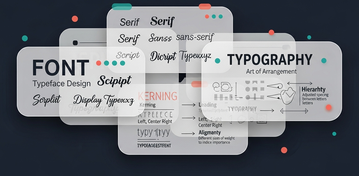
A typeface is a complete set of characters, font is a single instance within that typeface, typography is the practice of arranging text
Typeface Vs Font Vs Typography
When I started designing, I was thoroughly confused by the terms Typeface, Font and Typography. Most of us generally are. Let me explain the differences.
A typeface is the visual design of a set of characters, including letters, numbers, punctuation, and symbols, unified by consistent stylistic attributes such as stroke weight, proportion, contrast, and terminal treatment. A font is a single instance within that typeface having a specific size, weight, and style. Typography is the practice of arranging text so that it is both legible and visually appealing.
A typeface generally shares a consistent design style, characterised by specific visual traits like stroke width, serifs, or overall aesthetic.
Fonts were historically used as physical sets of metal type for printing. In a digital context, a font refers to the file or data that renders a specific style of a typeface on a device.
Typography refers to the art and technique of arranging text so that it looks clear, attractive, and easy to read. It is not just about choosing a nice font. It includes how letters, words, and paragraphs are placed on a page or screen.
Example:
Times New Roman is a typeface, Times New Roman 14px Bold is a font,
Choosing Times New Roman Regular, 16pt for body text, Times New Roman Bold, 24pt for headings, and setting line spacing to 1.5 is typography
As an analogy, let us consider that you are preparing a mango dessert:
The mangoes can be compared to the typeface, the overall variety or the fruit you choose. You choose the Alphonso Mango Tin for the dessert, which is comparable to selecting the font with a specific style, size and weight.
The way you plate the dessert and garnish the mango pulp to make it look delicious can be compared to typography, the arrangement of text to make it legible and readable.
Have a story to share?
Join our community of designers sharing their experiences and insights.
Share Your Story