Design Strategy
Interaction Design
User Research
Design Stories
The Notebook She Never Took Home Again
A true story from an enterprise UX project that changed how I define design success. Business metrics like dashboards, KPIs and efficiency gains demonstrate value, but the most meaningful impact of good design is rarely found in a report. Sometimes, it's measured in something far more meaningful: the time we give back to people's lives.
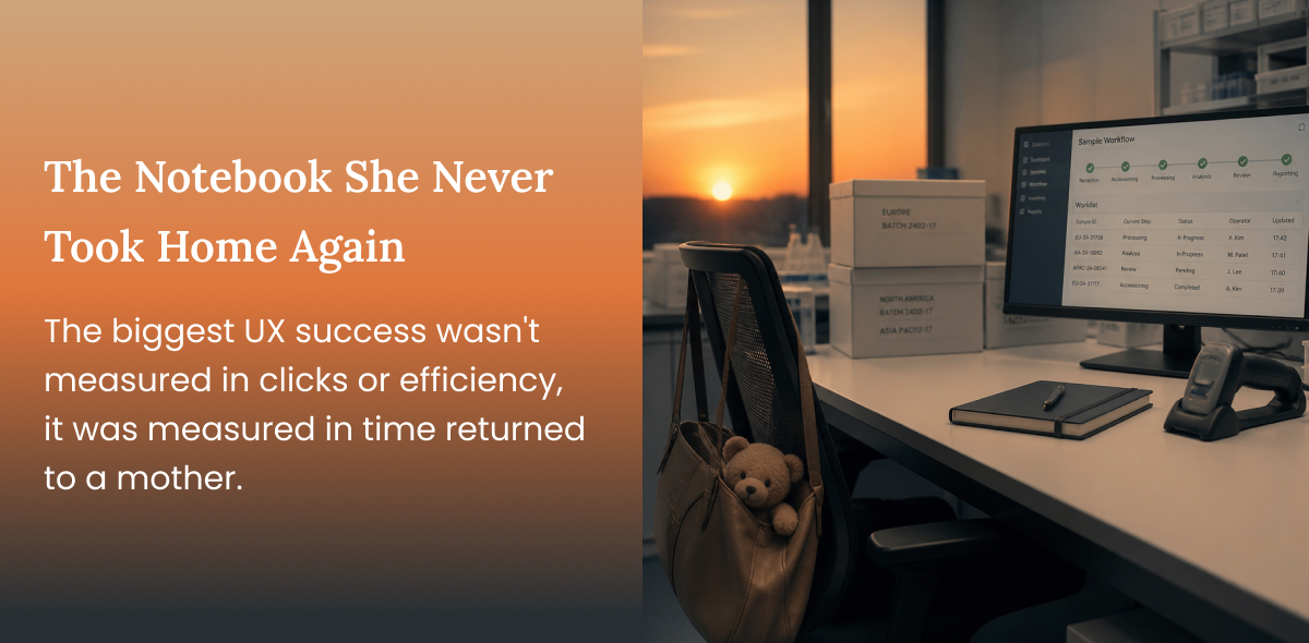
The technician started crying during our final design walkthrough.
Instead, she smiled.
"She's happy because this system will finally give her evenings back. She won't have to take her notebook home anymore."
The technician had a two-year-old daughter. Every evening, after putting her child to sleep, she would reopen the notebook she carried home from work and spend another hour or two copying test results into Excel.
That moment completely changed how I measured the success of enterprise UX.
The project had started as an effort to improve operational efficiency. It ended up giving someone her time back.
When I joined the engagement, I assumed the challenge was straightforward.
A global organisation wanted to replace Excel with a purpose-built application for technicians working in quality assurance laboratories. The labs performed hundreds of quality checks on everyday consumer products before they reached customers. Every sample underwent nearly 200 different tests, and every reading eventually found its way into a maze of Excel worksheets.
Conducting that research was not easy. This was a couple of years ago, long before remote ethnographic research had become common. Visiting the laboratories wasn't an option, so every interview, observation session, and workshop took place over video calls. Since the technicians spoke only Spanish, every conversation depended on translators. We scheduled multiple shadowing sessions, some lasting nearly half a day, asking technicians to walk us through their workspaces as if we were standing beside them.
Before the first session, I imagined large industrial laboratories with rows of sophisticated machinery. Instead, I saw something surprisingly simpler. A monitor, a weighing machine, compact testing equipment, cupboards lined with carefully organised samples, sticky notes everywhere and beside every keyboard sat a notebook.
That notebook immediately caught my attention because it seemed to be used far more often than Excel itself.
---
Managers assumed their staff was using Excel. As we observed more technicians, one pattern became impossible to ignore. Nobody entered results into Excel while performing the tests.
Everyone wrote everything in notebooks first. Only later did they transfer the data into spreadsheets. Initially, this looked like resistance to technology, but it wasn't. It was simply the only way the software allowed them to work.
One technician preferred collecting a single batch from one region and completing every required test before moving on to the next batch. Another preferred method is to gather samples from multiple regions, perform a specific test on all of them together, record the values, and then repeat the process with the next test. Both approaches reduced unnecessary movement around the laboratory and helped them make better use of the testing equipment.
The Excel templates forced both of them into the same documentation process. So they quietly created their own backup, infact the notebook had become the real system. Excel was merely where the day's work was documented before managers generated reports.
One of the biggest advantages of remote shadowing was that we weren't limited to observing the screen. We could observe everything around it.
Technicians showed us how samples were stored inside cupboards organised by product, region and batch number. They explained how they collected samples before beginning a testing cycle and why they rarely mixed different product categories. They showed us the sticky notes they relied on to remember testing sequences and how they moved repeatedly between storage, equipment and their workstation throughout the day.
Once we understood that, the design problem changed completely. Our design strategy was reframed around connecting software with the way people actually worked. Designing around movement instead of screens.
Instead of organising the application around worksheets and tables, we organised it around how technicians naturally picked up samples, grouped work and completed testing. The digital experience started reflecting the laboratory itself.
Once we understood how work actually happened, many design decisions became obvious. Technicians shouldn't have to repeatedly select the same product, region or batch for every reading because those values rarely changed during a testing session. Once selected, the application retained that context until they intentionally moved to the next batch.
The structure of data entry remained consistent throughout the application so repeated actions quickly became muscle memory. Thresholds highlighted abnormal readings immediately, reducing the chance of unnoticed errors. Since supervisors were frequently called to answer the same questions, contextual guidance and FAQs became part of the workflow instead of separate documentation.
Interestingly, the interface still resembled a spreadsheet. That was intentional, so we reduced the learning curve of a new system. Most technicians had very little experience with software beyond Microsoft Office. Making the application visually familiar reduced anxiety while removing the complexity that had accumulated inside Excel over the years.
---
Having heard Excel so many times, we were biased toward the problem, but as we continued observing the technicians, another hidden workflow emerged. Every tested sample had to be photographed. The photograph was taken on a mobile phone, uploaded separately to a server, manually renamed, matched to the correct batch and finally attached while creating reports.
It wasn't anyone's favourite part of the job. Fortunately, every sample already carried a barcode, and this made our design decision easy.
Technicians could scan the barcode using their mobile device, connect it with the active desktop session and upload photographs directly against the correct test record. The images became part of the testing workflow instead of another disconnected process.
Once testing was complete, reports could be generated automatically using predefined templates for individual or multiple batches, significantly reducing the manual effort required from managers.
When translation became a UX challenge
The research wasn't the only place where language shaped the project.
The application was designed in English before being localised into Spanish.
Labels grew longer, buttons became misaligned, tables expanded, and carefully balanced layouts suddenly looked crowded. We went through several rounds of localisation, refining both the content and the interface until neither language felt like an afterthought.
This was not new to me, as I had worked earlier on Localisation. In my earlier cases, the organisations had a very mature localisation practise, where localisation was considered during the design and not after.
It was a reiteration of my learning that Localisation is part of designing.
Our engagement ended with a fully designed product ready for engineering implementation. We weren't responsible for development, but every workflow, interaction, validation, reporting scenario and localisation requirement had been designed and documented for the implementation team.
The business impact was significant. Manual transcription reduced dramatically because technicians could record results while testing instead of rewriting them later. Report generation became automated, managers spent less time consolidating spreadsheets, and the laboratories were able to process substantially more samples without increasing operational effort.
While we as a team were focused on business and operational metrics, the last design review gave me something I hadn't expected.
Years later, I hardly remember some of the throughput improvements. Around 300% operational efficiency and 99% error reduction. What I remember the most is the technician who cried because she wouldn't have to take her notebook home anymore.
Enterprise UX is often measured by dashboards, KPIs and efficiency gains. Those metrics matter because they demonstrate business value. But the most meaningful outcomes of good design are rarely found in a report.
They're found in the lives of the people who use it. Sometimes good UX saves a few clicks. Sometimes it prevents costly mistakes. And sometimes, it gives a working mother an extra hour with her child.
That's a metric no dashboard can truly capture.
Have a story to share?
Join our community of designers sharing their experiences and insights.
Share Your Story