Healthcare UX
Interaction Design
Design Stories
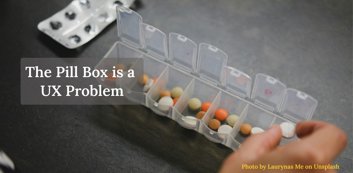
The Pill Box is a UX Problem
When we talk about Healthcare UX, we generally think about digital products - apps, dashboards, and technology integration. But physical healthcare products are used every single day, and yet they are rarely discussed from a design perspective. Here are a few of my design thoughts on something as simple and as important as a pill box.
For the past two weeks, I have been accompanying a family member to doctor appointments. During that time, I noticed how a couple of things that felt simple to us could become complex for the elderly. One such experience was organising pills that had to be taken.
She was prescribed around 10 pills. Some in the morning before food, some after food and some in the night after food. The instructions were on paper and on the app. The person is not tech-savvy and can read minimal English. Understanding her problem, I arranged all the medicine sheets and boxes for each time into separate containers and returned home, assuming things were sorted.
After three days, she called me, telling me she had difficulty taking the medicine at the right time.
When I went back and sat with her, I understood her problem. Due to a recent problem with her eyesight, she was unable to read the names on the medicine boxes. Most of the medicines looked the same. She also struggled with her finger movement, so popping pills was difficult. She would forget which one was popped out and was at a high risk of double-dosing or missing medication due to the similar colours and shapes of medicines.
As an immediate fix, I separated the medicines for each time of the day and put them into separate zip lock pouches, sketched large visuals and put a paper to represent when each med had to be taken. And suddenly, she was clear on the medications, and it worked. That was when it struck me. This was not her memory problem, but a design problem. The system required her to remember. It did not help her recognise.
What changed was just the design! Nothing changed about her memory or her discipline.
If a small change could help, a better-designed pill product must exist. I started to search online for a Pill Box. I was happy someone had identified the problem and had a product that helped organise the pills. Beautiful colours, detachable, easy to carry during travel. I felt good initially, but as I explored, I realised most products focus on day segmentation (7X3 or 7X4 formats), but very few address food-dependent times, recognition clues or error feedback on empty states.
When we talk about Healthcare UX, we generally think about digital products - apps, dashboards, and technology integration. But physical healthcare products are used every single day, and yet they are rarely discussed from a design perspective. Here are a few of my design thoughts on something as simple and as important as a pill box.
Like any other product, designing a pill box starts with understanding the users. In a country like India, medication management is a shared household responsibility, and the product needs to be designed considering the patient as well as the caregiver. People here speak multiple languages, and may have low tech-saviness and limited English literacy, especially among elderly people. It is important to understand their behaviours.
In general, medical non-adherence is one of the main reasons for hospitalisation among elderly people. Behavioural issues like people missing dosages, confusion in morning or evening doses, mixing up meds, medicines with similar colour, shape and size, forgetfulness contribute to most of these.
Most often, people with chronic diseases are prescribed 3 to 8 meds per day to be taken at various times, and some to be taken after and before food, or with complex dosages like one or twice a week, which adds to the complexity.
Elderly users who struggle with other challenges as Low vision, poor lighting, dexterity or motor problems, with tremors or arthritis, could struggle opening lids or popping out medicines.
Not to forget, child safety, considering the joint family system in India.
Designing for Safety, not storage
Boxes that help organise and use pills by day of week, and by different times of the day, are the core needs of medication management.
Design for Cognitive Safety
Goal: Recognition over Recall.
Design should provide a clear time of day container segments and clear visual clues for before and after food. Clear visual communication is important with clear bold fonts and iconography using simple illustrations(Sun, Moon, food icons), colour-coded time bands. Weekly grid for pattern recognition, Transparent lids to show empty state. Medicines are daily reminders of illness and are emotionally draining. Designs with soothing colours can make it aesthetically appealing.
Physical Safety
Goal: Design for accessibility and safety of elderly users with dexterity and low vision issues.
A light-weight box that is handy and portable with larger grip areas, textured surfaces, rounded corners, larger compartments, low-force opening lids, and high contrast prints that do not fade would make a huge difference.
Microinteractions
Goal: Timely Feedback and Error Prevention.
Reduce double dosing, skipped doses and time confusion. We talk about micro interactions in the digital world. Micro interactions in the physical world are equally important. A simple feedback mechanism of soft sound when a box opens or is locked. Transparent boxes showing an empty state could avoid missed meds. Distinct compartment shapes for different times, one-directional opening flow.
Design for Caregiver
Goal: Reduce Caregiver Errors, save time.
Design should provide larger, distinct, filling compartments, with clear capacity indicators. Label areas would help in any notes or custom timing, colour differentiation by day, child-lock safety, easy cleaning and modular detachable trays for travel.
We can make these Pill Boxes smarter, with sensors, reminders and app integration. But for many users, cost and adoption could be a real challenge. Not every challenge needs a digital solution. Better physical designs can solve these more efficiently.
A Pill Box is just one of the examples. There could be more to add, from Insulin pens to glucometers to Inhalers.
As designers, we are not just shaping interfaces, but we are shaping safety. It is our moral responsibility to designCreating products or solutions that are user-centred and solve real problems while being useful, usable, desirable, accessible, and valuable, both for the user and the business. healthcare products that are safe, inclusive and built for real human conditions.
Have a story to share?
Join our community of designers sharing their experiences and insights.
Share Your Story