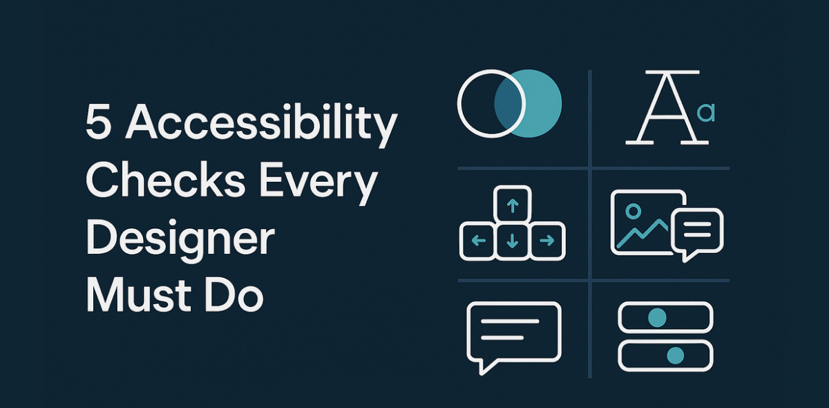
Foundations
Interaction Design
Beginners Guide
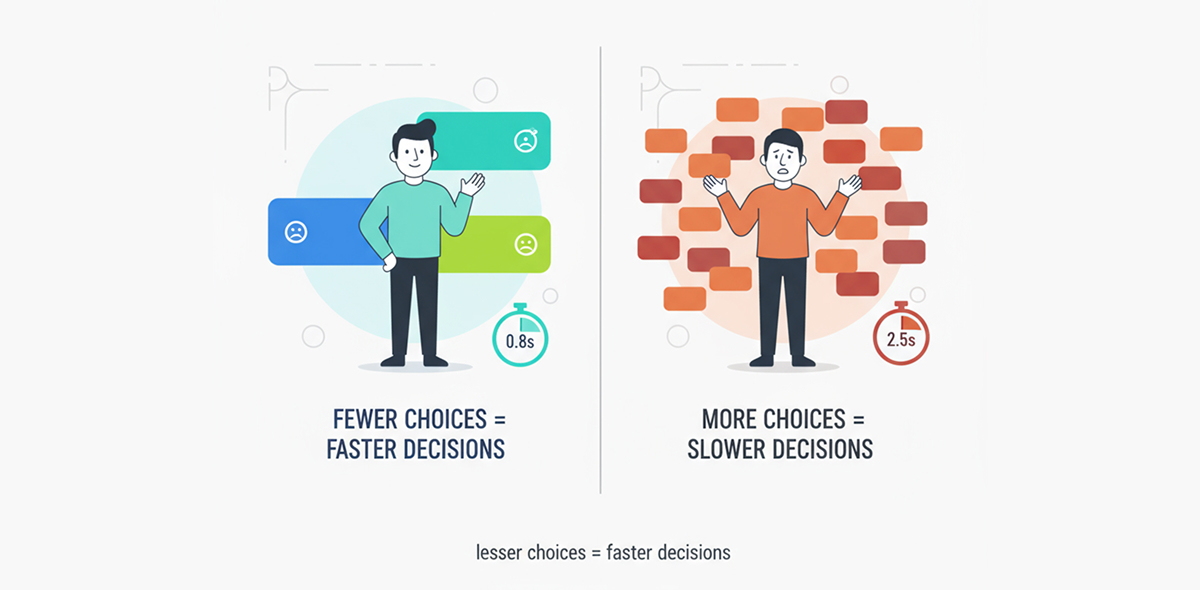
Too Many Choices Spoil the Click - Hick’s Law
When faced with too many options, decision-making slows down, which in turn delays action to be taken.
Hick’s Law
You have probably heard the proverb, "Too many cooks spoil the broth". This is essentially what Hick’s Law describes in the context of modern world designs. When faced with too many options, decision-making slows down, which in turn delays action to be taken.
Consider a scenario many of us can relate to. Imagine a family or group of friends deciding to prepare dinner together. Everyone gets involved in making the soup, but each person has a different idea. One suggests extra spice, another less spice enhances the flavour, one suggests cooking with butter while another without, one insists on canned diced tomatoes while another suggests fresh tomato puree. By the time they agree on the right recipe and method of cooking, the soup is overcooked and doesn’t taste as expected. This is exactly what happens when there are too many choices. The more options there are, the longer it takes to make a decision, and this is what Hick's law is all about.
Hick’s Law is a principle from psychology and human-computer interaction that describes the relationship between the number of choices and decision-making time. Hick’s Law states: The time it takes to make a decision increases as the number of choices increases. Simply put, more options = slower decisions. Too many choices can overwhelm people, slowing down decisions. Simplifying options or grouping choices can improve efficiency and user experience, commonly applied in the design of menus, forms, and navigation. The common example that is generally stated is of a restaurant menu. If there are only 5 items to choose from, it takes less time, but if the menu has 50 items, it takes longer to decide. If a restaurant serves 50 items, it cannot avoid displaying them on the menu and hence needs to follow the methods of grouping and chunking cognitive load.
5 Examples Where Hick’s Law Improves User Experience
- Google Search is a classic example of minimalism. There is only one primary action, keeping it focused and easy to take an action.
- WhatsApp keeps navigation simple with four main tabs: Chats, Updates, Communities, and Calls. A floating action button for “New Chat”, a search bar, and a quick list of recent chats allow users to act fast. New messages appear as bubbles, progressively revealing the next action. This design reduces clutter and helps users take faster actions.
- Google Photos organises content with logical tabs like Photos, Library, and Search. Photos are grouped by date, and clicking on a photo reveals only essential actions like share, edit, add to, or delete. Additional options appear progressively, guiding users step by step
- E-commerce platforms such as Amazon or Flipkart use personalisation and recommendations. For example, when you search for a book, related suggestions appear below, narrowing choices to the most relevant options and reducing decision fatigue.
- Netflix presents curated, personalised rows like “Continue Watching,” “Trending Now,” and “Top Picks for You,” allowing users to choose content quickly without feeling overwhelmed.
5 Examples of Choice Overload Caused by Ignoring Hick’s Law
- On most search engines, the results page can feel cluttered with sections such as sponsored ads, “People Also Ask,” AI summaries, and organic listings. This overload of options can make it harder for users to decide what to click next.
- On OTT platform home screens, endless scrolling can frustrate users who are not sure what to watch. Too many options at once can slow down decision-making and lower user engagement.
- Filters on online shopping sites are another example of choice overload. Shoppers could get annoyed by the number of options on filters for categories, brands, colours, prices, and features, making product selection stressful and time-consuming.
- On music apps, curated playlists contain hundreds of songs. Users can spend excessive time scrolling and comparing tracks before choosing, leading to slower decision-making.
- The social media apps often present too many competing actions at once, such as feed updates, reels, messages, notifications, and suggested connections. This overload slows users down in deciding what to act on first.
Hick’s Law teaches us a simple but powerful concept. The more choices we present, the longer it takes for people to make a decision. Be it in daily life or digital experiences, excessive options can lead to confusion, decision fatigue, and even frustration. Designers should take care to present limited choices, prioritise key actions, and progressively disclose additional options. By applying Hick’s Law thoughtfully, we can reduce cognitive load, speed up decisions, and create interfaces and environments that feel intuitive and effortless.
In short, "Too many choices don’t just spoil the broth, but they spoil the click".
Have a story to share?
Join our community of designers sharing their experiences and insights.
Share Your Story