Foundations
Quick Read
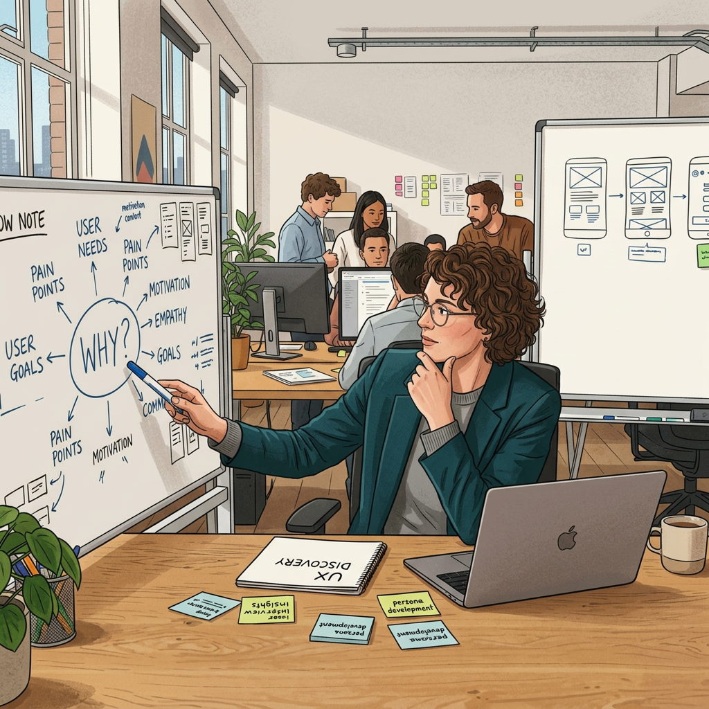
Designers should champion the “why” behind the user’s need.
Designers should champion the “why” behind the user’s need.

Explore our complete collection of design stories, insights, and quick reads from the UX community.
Showing 10 out of 25 stories
Designers should champion the “why” behind the user’s need.
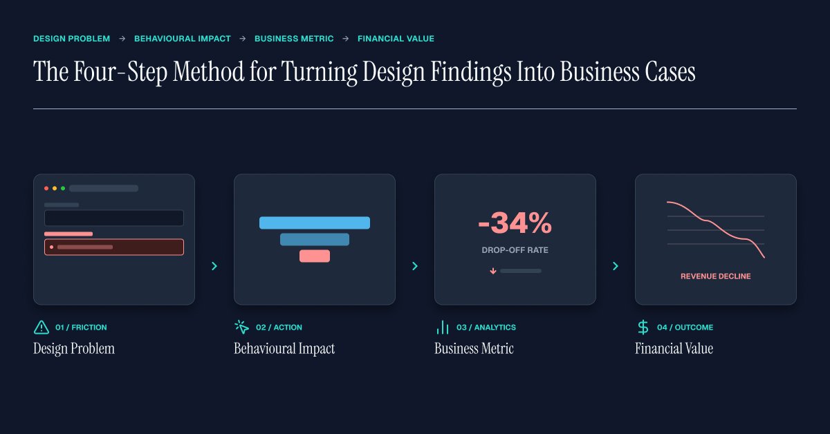
A design finding becomes more actionable when it is connected to measurable business impact. This four-step method helps designers move from identifying a design problem to quantifying its behavioural, business, and financial implications—making design recommendations easier to prioritise, fund, and measure.
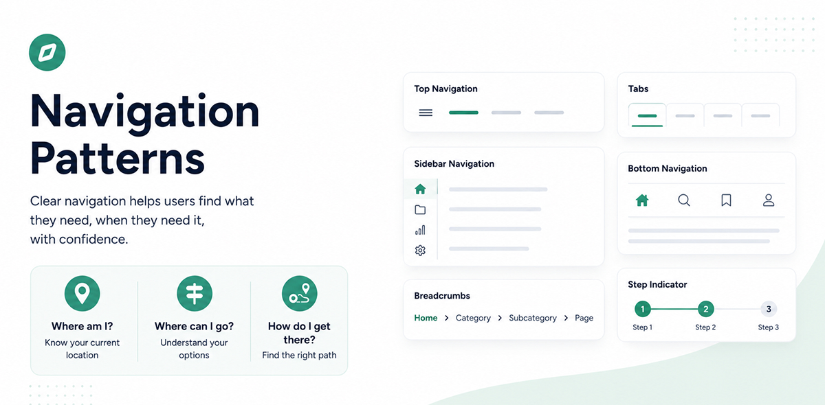
This series explores the different navigation patterns used across desktop and mobile products. Each story looks at a specific pattern, helping you understand what it is, when to use it, what to consider while designing it, and how to choose the right pattern for your product.
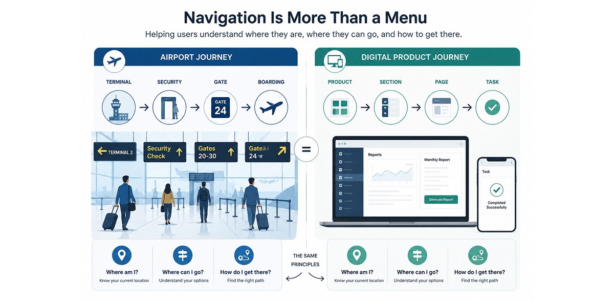
This story introduces navigation as more than just a menu or UI component. Using an airport as a familiar example, it explains how good navigation helps users understand where they are, where they can go, and how to get there. It explores navigation as a connected system shaped by users, content, tasks, and context, setting the foundation for understanding different navigation patterns across desktop and mobile products.

A true story from an enterprise UX project that changed how I define design success. Business metrics like dashboards, KPIs and efficiency gains demonstrate value, but the most meaningful impact of good design is rarely found in a report. Sometimes, it's measured in something far more meaningful: the time we give back to people's lives.
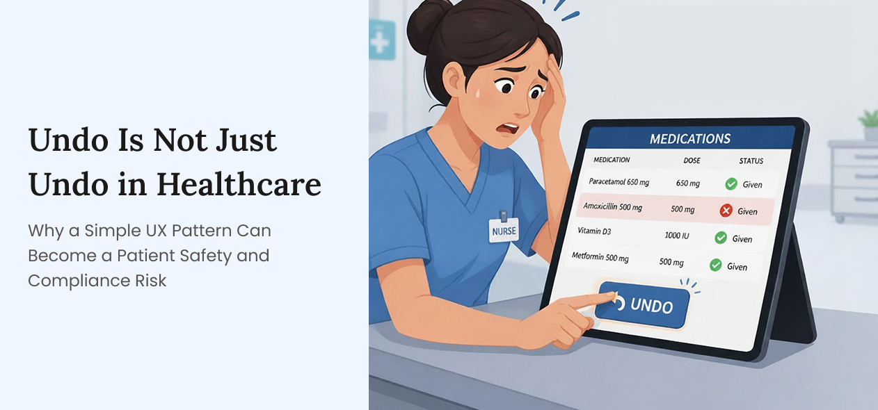
An "Undo" button may seem like a small interaction pattern, but in healthcare it can influence patient safety, staff accountability, compliance readiness, and organisational trust. A Simple UX Pattern Can Become a Patient Safety and Compliance Risk.
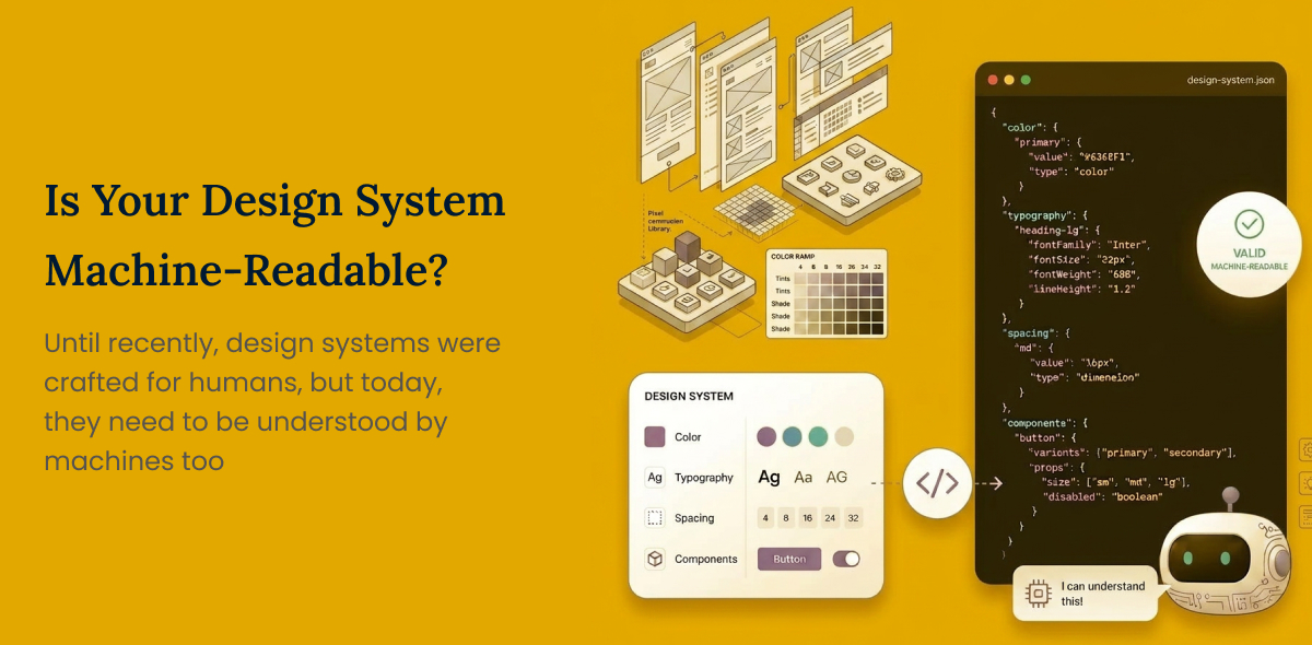
Until recently, design systems were crafted for humans, but today, they need to be understood by machines too
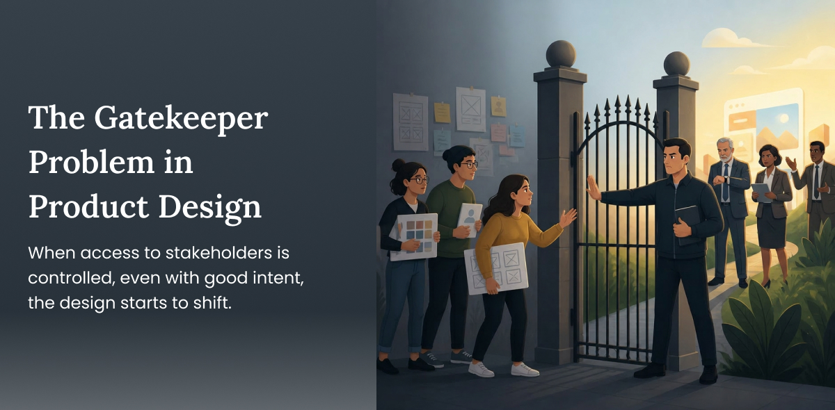
When access to stakeholders is controlled, even with good intent, the design starts to shift. It moves from being insight-driven to instruction-driven.
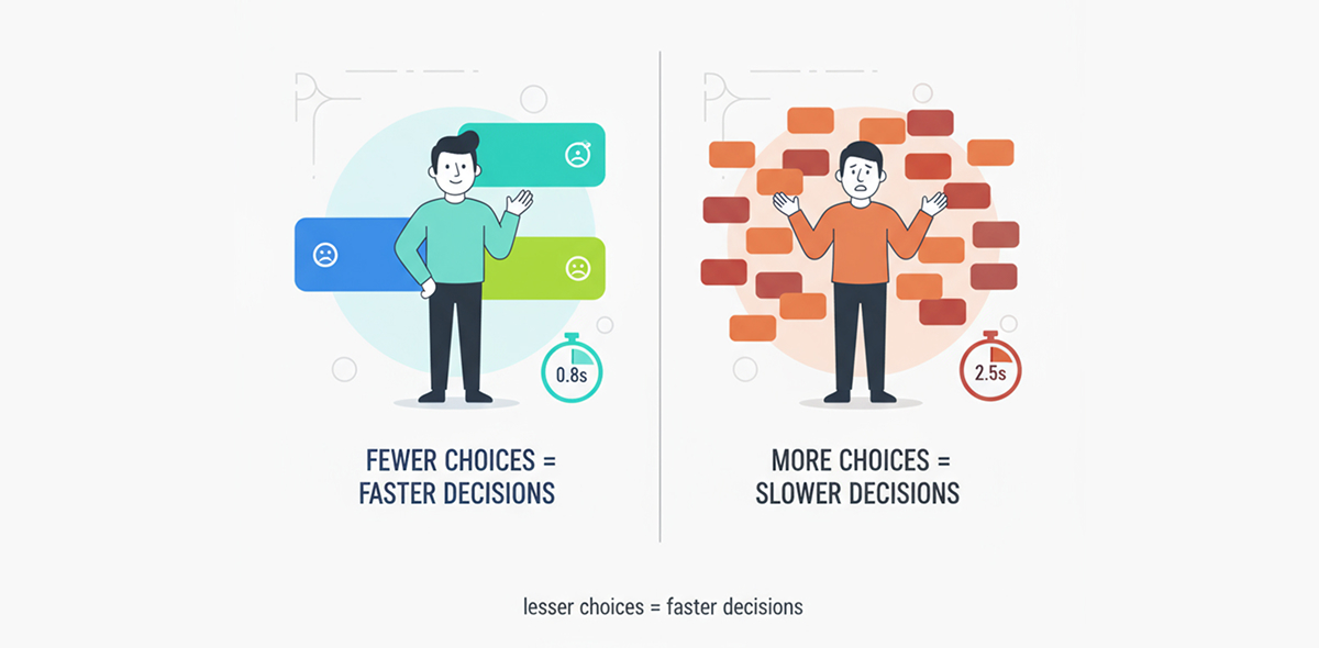
When faced with too many options, decision-making slows down, which in turn delays action to be taken.
When users abandon carts, get stuck in confusing flows, or leave forms half-filled, designers are often the first ones to get blamed.